Empty Canvas is a nice, minimalistic theme for WordPress. I’ve implemented it here, but haven’t had a chance to generate a child theme off it to fix some of the things I don’t like (such as how it handles links). Overall, though, a nice simple base to start from.
Tag: Themes
BlueSkool WordPress Theme
I really like the newly released, free WordPress Theme BlueSkool. It is a simple, straightforward them that manages to be visually striking without throwing dozens of different elements in your face.

P2 Prologue Theme — An Update for WordPress Microblogging Platform
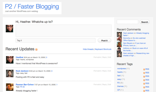
Lorelle VanFossen has a nice summary of the newly updated Prologue Theme, P2. Prologue is a WordPress theme that turns your WordPress blog into a Twitter-like tool for organizing groups or whatever. I have a private microblog using Prologue that I update via e-mail for stuff I want to keep track of/update that I don’t necessarily want to share with the entire world. Works like a charm.

Ian Stewart on Child Themes in WordPress 2.7
 WeblogToolsCollection.com has a two–part interview with Ian Stewart about changes in the way Child Themes are implemented in WordPress 2.7. WordPress already has a fairly powerful Parent-Child Theme setup that allows you to set up a Theme as a parent and then create a Child Theme that inherits everything in the child theme. You can then screw around with the CSS in the child theme to get the look and feel you want without touching the parent theme.
This way, you avoid having to redo all sorts of changes when the parent theme gets upgraded due to a new WordPress version, etc.
WordPress 2.7 kicks it up a notch,
Secondly, as of WordPress 2.7, template files located in your Child Theme folder will be used instead of the template file in your Parent Theme folder. Don’t like how the header is coded up for a particular theme you want to edit? Copy the header.php file from your Parent theme into your Child Theme folder and make the change there. WordPress, as of 2.7, will look for header.php (or any possible template file) in the Child Theme first and use the Child Theme template file instead. This new feature in WordPress 2.7 makes custom theming really exciting and even easier.
The first thing I always have to do with any WordPress theme is modify the header, and this will make it easy to do that just once and then not have to worry about upgrades and/or when I change Sandbox-based themes (copy the header.php to the new child theme directory).
Very nice.
Grey Matter Theme for WordPress
Most WordPress themes seem to rely on a few core design principles: a) there’s no such thing as too many columns — 4 is good but 5 or 6 are even better; b) you just can’t have too many distracting visual elements — nobody visits a site for content, what they really want to see are giant icons; c) garish backgrounds and header graphics help drive traffic — if visitors can easily read the content the first time, they might never come back.
So as much as I like it, it is clear that Nikolaj Masnikov’s nicely understated Grey Matter Theme is probably not the theme you’re looking for,

What the hell? A simple, straightforward color scheme? Where are the garish buttons? Why would anyone want to put the title of their blog up at top when a high contrast picture of clowns or perhaps daffodils would be so much easier on the eyes?
Man, what was that guy thinking?